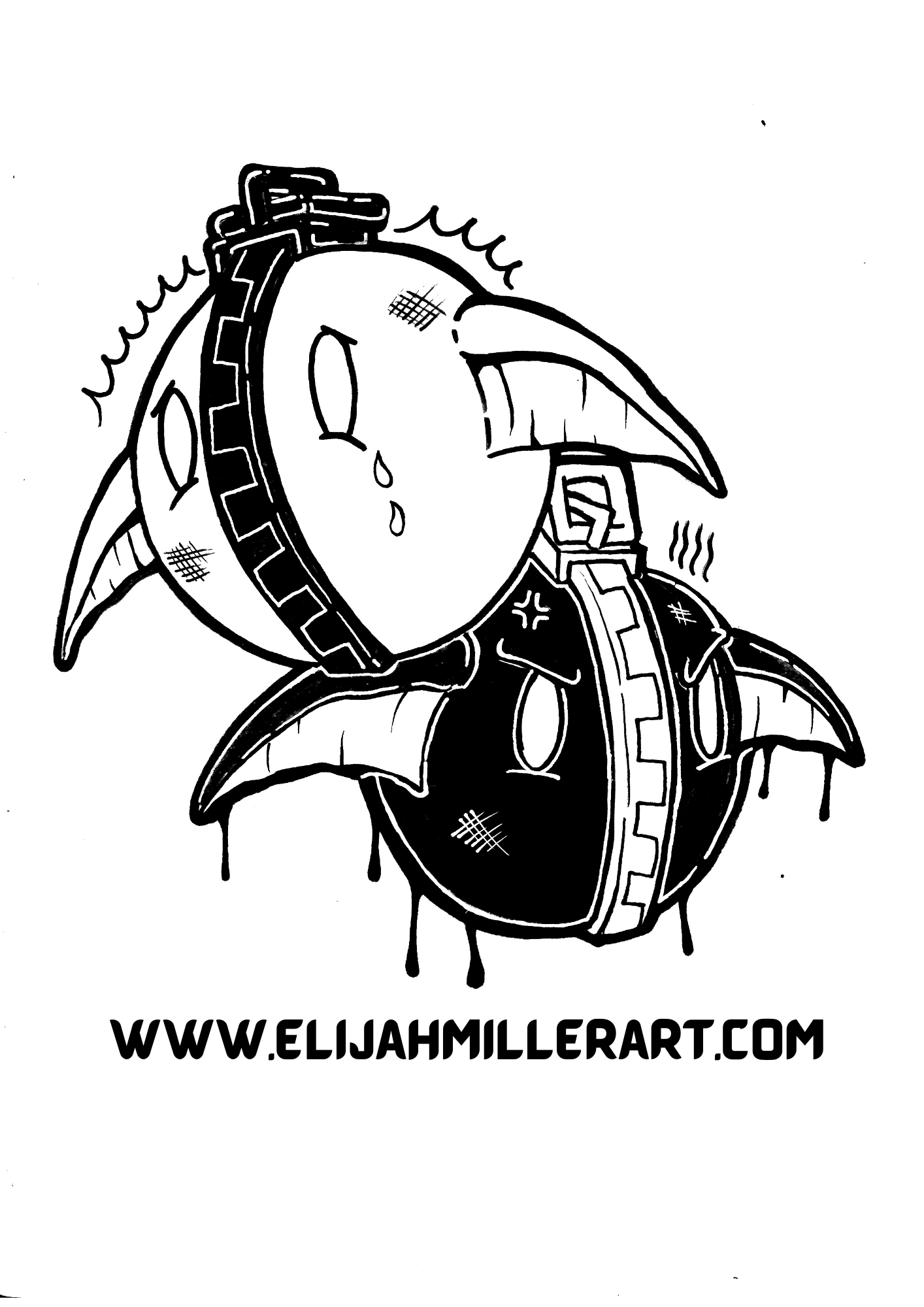
Showing my character illustration process.

This is the completed illustration for a new addition to the Broken Halos series characters. I call him “Lurch”.
Whenever it comes to thinking about my favorite aspects of making art I seem to always gravitate towards the conclusion that the process is by far the most interesting part for me.
Even more than appreciating a finished piece I find that the process is by far the most inspiring part, as well as the most meditative part of the practice. After I finished creating a new character to add to the Broken Halos I flipped back through my photos and realized I had actually documented the whole thing from start to finish. So without further ado here’s how I did it!
The first step for me especially with characters is sketching as loosely and freely as possible. Usually I start by researching reference images for all the elements of the work like clothing, human anatomy, poses, animal anatomy, etc. Once I inform my brain with enough material I just let my hand go on a tangent not worrying about whether anything looks good or not but focusing on conceptualizing the raw ideas. I push out as much as I can or at least what I deem necessary for the project at hand.

For this particular project I didn’t seem to yield the normal output of raw ideas that I usually have, but I still got everything I needed from this sketch session.

After I get those ideas down and sorted out I transition into laying down the sketch for the final drawing. I use a 2h or the lightest pencil I can find to do this part.
My goal at this stage is to lay out a strong foundation to work on top of. I structure the drawing and suggest the different textures on the figure. This is so crucial because it basically sets the trajectory for your drawings success. Remember that no amount of detail or great rendering can compensate for a drawing with a bad foundation.

Initial sketch for character

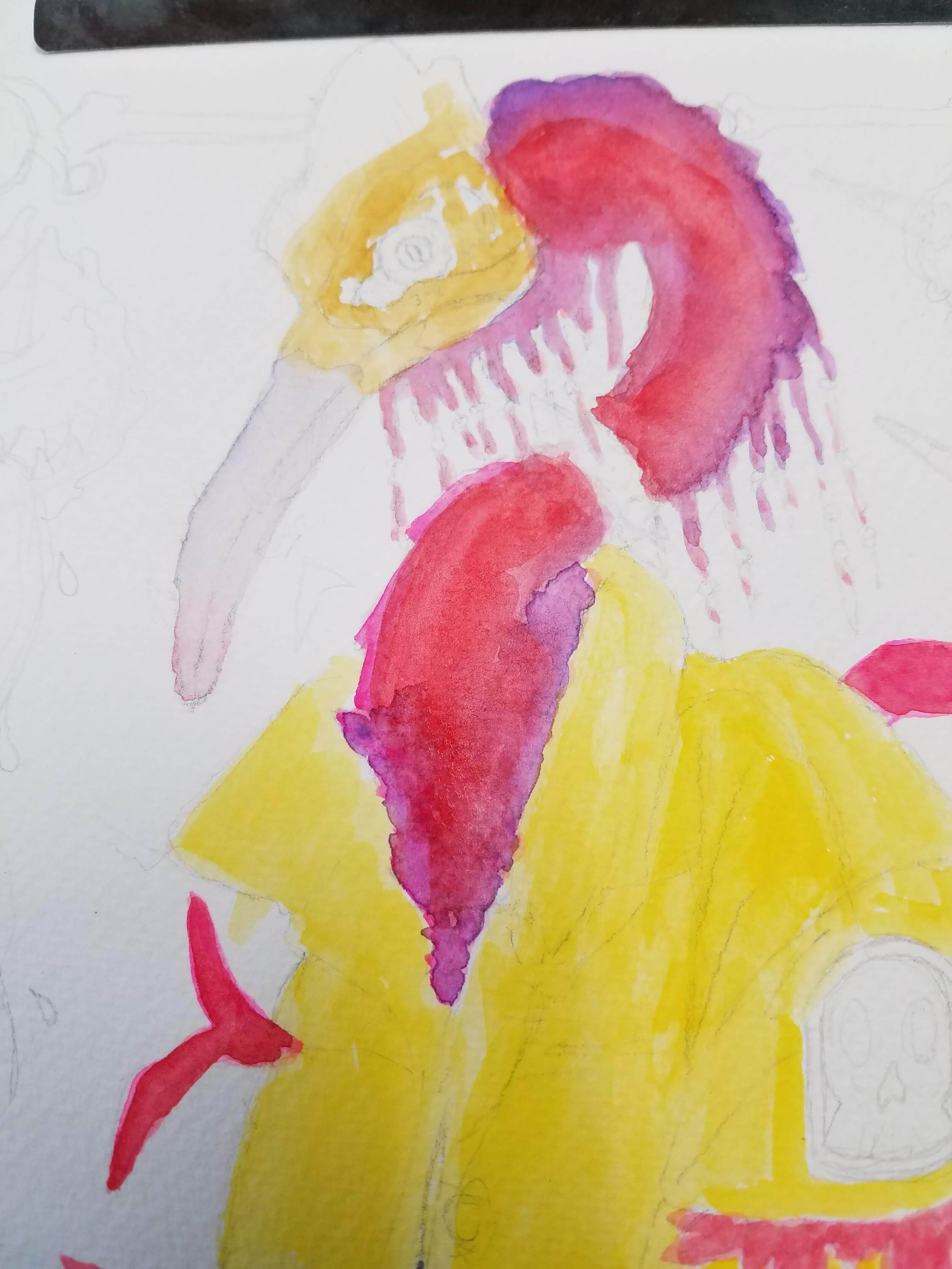
Close up of Lurch’s face.
After the final sketch is laid down I start with the initial washes of color and block out the figure. I use the wet on wet painting technique with my watercolors which includes first saturating an area of the paper with water first, then painting directly on it with wet watercolor paint. I’m laying down flat washes of color not a lot of detail at this point. I just want to establish the character quick and loosely and keep that type of fluid energy while I continue to work.

Initial wash of watercolor to block out character shapes.
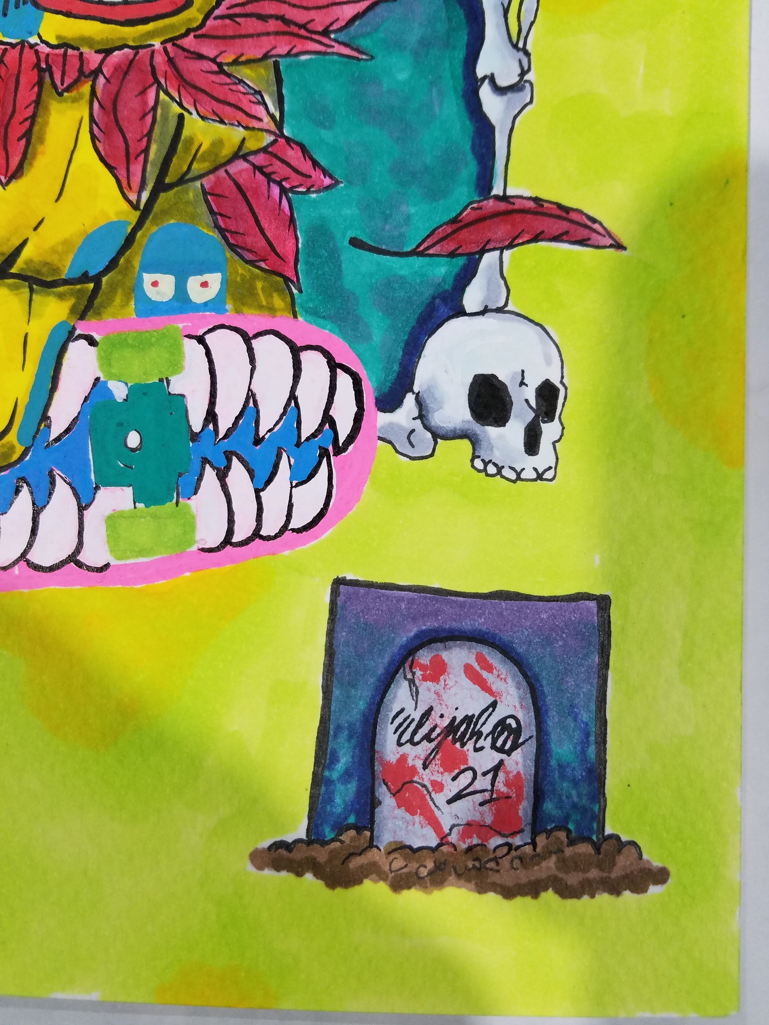
I also do this for the secondary characters in the back. Still flatting but it makes the unicorn slime balls pop out nicely for now before I add details. For these little guys I’m using Molotow brand 127 High Solid acrylic markers. In essence I’m still just establishing where all the elements of the drawing are before rendering them to completion.

More color blocking of the secondary characters.
After this initial flat layer of color is put down I pull out my pen and ink, and a few technical pens to start dropping ink. I always prefer to apply ink after color is laid out. I really like dip pens and ink because the just have a feel in my hand that’s really comfortable for me. In this Drawing I used a Zebra brand G nib to ink the main character in the foreground. this nib is a more flexible nib so it allows a wider variety of marks to be made if you want. I use an Edding technical pen to outline the unicorn slimes and I use another one with a smaller point size to draw the skeleton frame in the background. Normally I really only use the technical pens in sketches and studies but they worked here in the sense that varying the line weights helps create separation and establishes foreground, middleground, and background to create depth. I use bolder marks made from the G nib to make the character stand out while the fixed smaller point sizes describe the information that is further away from the viewer.

Line work applied over first color wash.

Detail
From this point on I am going to jump back and forth from inking, painting, and coloring

More line work and color

Added some extra steelo to the jacket!
This is the point in the drawing where I finally relax and have the most fun. The blue ghosts on the jacket was a completely spontaneous decision. I don’t even know why I did it but it was one of my favorite contrasting elements of the drawing. I may have to produce these in the future!

Color laid in on the primary background within the frame.
I had a lot of fun working on the character but I cannot neglect the background. It is so important to give your backgrounds the proper attention they need because they can do so much to complete the illustration. I say treat the background like a character, especially when characters are in it. With that being said my intention of drawing this skeleton frame in the background was to create depth. I thought about filling it with a contrasting color to make the drawing pop but I couldn’t find the right colors until I completed the character. I decided that an overall cooler color palette would be the right hit. I feel I was definitely right. I started with a particular blue marker but the blue alone felt flat. So after some color testing on my tombstone corner piece in the drawing I decided adding the purple and blending the markers for more depth and I was gonna give me what I wanted. I started with some light color blocking on the opposite sides and blended more heavily towards the center of the frame. After this I lightly blend the opposite colors on the color blocked sides and that’s it! Came out way better than I thought. After this I added another layer of contrast by using green and yellow markers to color the secondary background around the frame and character. After some more blending back and forth I pushed the background to completion. After this I just tighten up the drawing, back make sure line work is in place and adding necessary details.
Detail

Detail

Completed character illustration!!!
And alas! I have completed a character illustration of a new Broken Halos character. Meet Lurch! This was a fun process and it’s even more fun to share. I hope this gave some insight into my process and if you learned from it even better then. There will be more to come so stay tuned and thanks for checking out my process.